Transform Your Homepage into a Patient Magnet: Copywriting Essentials for Physical Therapy Website Home Pages

Complexity Results In Confusion, And Confusion Means You Get Nothing Done – Start With This For A Quick Win

Navigating the complex world of digital marketing can be confusing.  For a practice owner, there are constant distractions, this company promising 30 new patients, that company promising double digit growth etc.  For a small practice owner, the key is leveraging your money to buy the time of other niche experts.  One example of this is physical therapy website design and development – one of the core services here at E-rehab.com .

Understanding your market’s fundamentals, like how they use the web to find you and become a new patient, and implementing the right strategies can significantly amplify your success and save precious time.

PT practices on average get about 150 visitors to their website every month.  Converting more of those viewers to patients (i.e. conversion rate optimization), is an easy way to generate more new business without breaking the bank.

Focus On Your Home Page To Increase Conversions

In the past, I’ve talked about Donald Miller’s copywriting strategy that he discusses in Marketing Made Simple.  In this post, I’m going to delve into a slightly different way for practice owners to think about how they can write good copy for their home page…the most commonly visited page on your website (and therefore, the most important).

The Important Sections Of The Physical Therapy Website Home Page From Top To Bottom

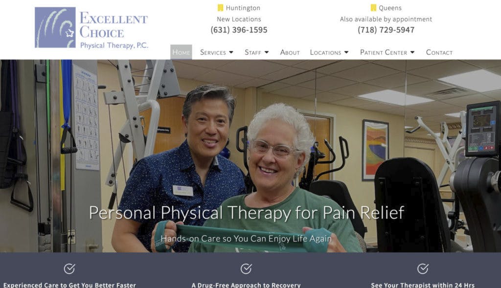
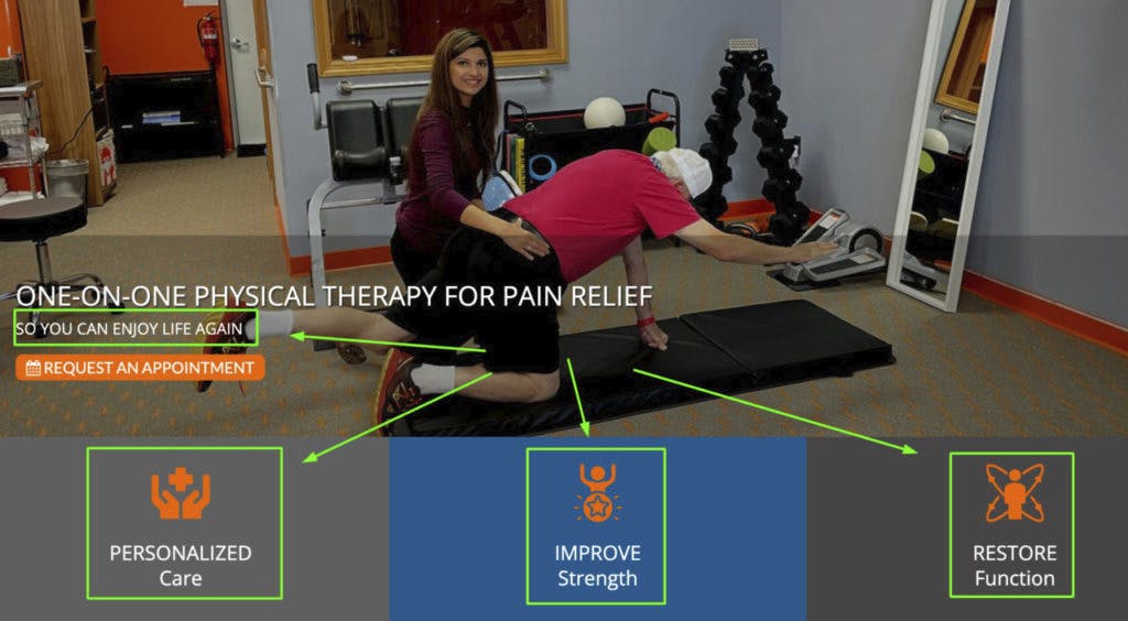
1. The Hero Section: Your Digital Handshake
Your website’s hero section is the virtual equivalent of a firm, warm handshake. It’s the initial interaction a potential patient has with your physical therapy website, and it sets the tone for their entire experience. Ensure this section succinctly communicates who you are, what unique benefits you offer, and how potential patients can engage with your services. A compelling headline about what you offer, a subheadline about the main benefits of your services, and a clear call-to-action (CTA) are not just elements; they are your first conversation with a potential patient.

2. The Problem Section: Addressing Pain Points
Understanding and articulating your clients’ challenges resonate more than listing services. Your website should empathize with the common issues your patients face, be it chronic back pain or post-surgical rehabilitation needs. This section is about connecting at an emotional level, showing that you not only understand their struggles but also have the expertise to alleviate them.

3. The Solution Section: Showcase Your Expertise
After highlighting the problems, it’s time to present your services as the antidote. Detail how your approach to physical therapy can transform your patients’ lives. Be specific about the benefits of choosing your practice. This could be your innovative treatment techniques, your personalized care plans, or your supportive, experienced staff.

4. The Journey: Guiding Through the Process
Like a treasure map, your website should guide potential patients through their care journey. Outline the steps from the initial evaluation to the completion of their treatment plan. This not only demystifies the process but also builds trust. Transparency in your service delivery process reassures potential patients that they are in capable hands.

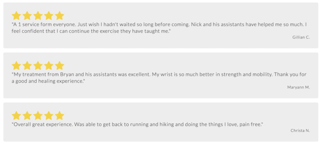
5. Social Proof: The Power of Testimonials
Leverage the power of social proof. Share success stories, testimonials, and case studies. Let your satisfied patients speak for you. Seeing real-life examples of how your services have improved others’ lives can be a powerful motivator for potential patients to choose your practice over others.

6. The Call to Action: Nudging Towards the Next Step
Every section of your website should have a purpose, driving visitors towards a decision. A well-placed CTA can make the difference between a visitor and a patient. Whether it’s scheduling a consultation or simply making a phone call, make sure your CTAs are clear, compelling, and lead to a straightforward next step.

7. Let Them Know How They Can Pay For Your Services

Let’s face it, health care is expensive. Your website should communicate how patients are expected to pay for services.  Do you take insurance?  Are you in-network? Are you a cash-based practice?  Let patients know how they will pay for your services and it will bring them one step closer to becoming a new patient.  Note, make sure not to include too much information.  You don’t want to dissuade a viewer from calling.  Detailed money discussions are best done over the phone.

Reminder - You Provide Exceptional Value, But You Have To Sell It
There are literally hundreds of research papers that suggest that physical therapy is the best first choice for musculoskeletal disorders. If you haven’t read the information at valueofpt.com, it’s worth a read.  It’s a great refresher of how we can save patients time, money, and help them get back to enjoying life again.

Crafting the copy for your physical therapy private practice website is more than just listing your services. It’s about creating a journey for your potential clients, one that acknowledges their pains, presents solutions, and guides them towards a healthier future.

By integrating this approach, you can create a website that not only stands out but also effectively converts visitors into patients Remember, in the digital world, your website is your storefront, your receptionist, and your best salesperson all rolled into one. Make every pixel count!

Want An Expert To Do All This Work For You?
That’s What We Do Here At E-rehab.com. Contact Us At (760) 585-9097 or Click Here To Request An Appointment

UGC – An Advanced Physical Therapy Marketing Tactic

One Tactic that You Should Include in Your Physical Therapy Marketing Mix – UGC

User-generated content (UGC) can be a powerful tool for building brand loyalty and increasing engagement, especially in a profession as impactful as physical therapy. Given that physical therapy is often the best first choice for addressing pain and musculoskeletal disorders, it’s crucial to communicate this message effectively to your target audience of seniors aged 55 and above. Here are eight UGC ideas tailored to your client’s needs:

1. “My Journey to Mobility” Video Testimonials

Encourage satisfied patients to share short video testimonials detailing their journey from pain to mobility through physical therapy. These real-life stories can resonate deeply with seniors who may be facing similar challenges.

2. Before-and-After Photos or Videos

Patients can submit before-and-after photos showcasing their progress, such as being able to walk without a cane or lifting an arm after shoulder surgery. These visual stories can be compelling proof of the efficacy of physical therapy.

3. Pain-Free Golden Years Social Media Challenge

Create a hashtag like #PainFreeGoldenYears and invite seniors to share their tips and experiences for maintaining a pain-free life through physical therapy. The best entries could win a free consultation or a set of resistance bands, for example.

4. “Ask a Therapist” Q&A Sessions

physical therapist teaching patient about ankle pain

Hold monthly live Q&A sessions on social media platforms where seniors can ask questions about physical therapy, and have real therapists answer them. Encourage participants to share these sessions, thereby spreading valuable information.

5. Community Exercise Challenges

Initiate a monthly exercise challenge focused on a specific area like “knee strength” or “back flexibility.” Participants can share their progress and tips, creating a supportive online community.

6. “Therapy Thursdays” Blog Posts

Invite patients to write guest blog posts about their physical therapy experiences, what they learned, and how they improved. This not only provides valuable content but also makes the patients feel like valued members of the community.

7. Spotlight Local Heroes

Feature stories of local seniors who have significantly improved their quality of life through physical therapy. These can be shared as blog posts, social media updates, or even short documentaries.

8. Virtual Workshops/Webinars

Host virtual or in-person workshops on topics like “Managing Arthritis” or “Improving Posture in Your Golden Years.” Encourage attendees to share their key takeaways and how they plan to implement them in their lives.

Focus on Engaging Your Community to Build Your Practice’s Brand Name

Each of these ideas serves dual purposes: they provide valuable information to your target audience while also encouraging interaction and engagement. By implementing these UGC strategies, physical therapy practices not only boost their online presence but also establish themselves as a trusted resource for seniors seeking to improve their quality of life through physical therapy.

Physical Therapy Website Design for 2022

Here are five features that your physical therapy website developer must include in 2022.

1. Define your offer above the fold.

This means that you should state clearly what you are going to provide a viewer of your website (i.e. prospective patients).  What kind of offer to we recommend?  It depends on the type of patients you serve. For the orthopedic practice, we suggest you include something about pain relief.  90%+ of the patients that come into your practice have pain, so you want to let them know you can relieve it.


2. Repeat Your Calls to Action.


Why is it that department stores have cash registers throughout their location? They want to make it fast and easy for your to check out.  On your PT website you don’t know when someone has read enough to take the next step.  Make sure you include your calls to action frequently as the reader progresses down your homepage.


3. Add an Outcomes-Oriented Image.

Patients are more likely to work with you if they can see themselves as a successful patient in your clinic.  Include pictures of happy, smiling patients on your website so patients can see themselves in the story that you are telling.

4. Stack Your Value.

There are a number of factors that can persuade a patient to choose your practice. Make sure that you list your value propositions clearly on your website.  Make them short and easy to read as well for mobile viewers.


5. Make Sure You Have a Click-to-Call Button

physical therapy mobile website design

Take a look at your website analytics and in particular, the number of visitors to your website that are using smartphones.  You’re likely to see that half of your traffic or more are seeing your website on their smartphones.

If that is the case, then you need to make it easy for them to call you right from your website. While most phone browsers will recognize your phone number and enable this. you can use the <tel> tag to make sure this is happening.  Then make sure you test this.


Add in These Features to Better Convert Website Viewers to Patients

Too often PT practice owners are more concerned with how their website looks rather than how they communicating with potential patients.  If you include the following features in your PT website design, you’ll increase your conversion rate without spending any additional money on marketing.

Need help with Your Physiotherapy Website Design in 2022?

If us a call at 800-460-5161 or you can click here to request an appointment.

Your About Us Page Could Be Suffering From These 6 Mistakes

Your About Us page probably has more website viewers land on it than you think. Too many companies treat this valuable real estate like an afterthought. They knock off a paragraph about why they started their practice or add in their mission and that’s about it.

Take advantage of this missed opportunity!

With so many eyes on this content, it needs to be some of the better work on your website. While a bad About Us page probably won’t destroy your practice, it could leave potential patients wanting more, before they choose you.

If you’re making these 6 frequent mistakes, it’s time for a rewrite.

1. It doesn’t show your personality

This is a common problem with website writing. People default to corporate-speak and start using phrases they’d never use in real life, like leverage, cutting-edge, etc. Cut out the jargon and just write like you talk!

Small practices shouldn’t hide their personalities behind the veil of boring corporate lingo. There’s nothing wrong with a fun or clever voice, on your About Us page, but do remember, you are a healthcare provider.

For a great example of this, check out PT Central.  https://ptcentral.org/about/ . Take a look at their commitments, values, and they even mention some of their partners in the community.

2. It focuses too much on you

Yes, it’s called an “About Us” page. So you will need to talk some about yourself and/or the company. But if you drone on for a full page about how great you are, your readers are going to zone out fast.

Dale Carnegie famously said, “…a person’s name is to that person, the sweetest and most important sound in any language.”  The quote speaks to a broader point — the most interesting thing in our lives is us. So while your reader may have some interest in you, what they really want to know is how you can benefit them.

You have to relate your story back to a benefit for the reader — aka, your potential customer. This doesn’t mean you should turn your About Us page into a sales page. But you should include what sets your company apart from the competition, and how that can solve the reader’s problem.

3. It doesn’t have a strong headline

If the headline of your About Us page says “About Us,” we might want to change it. Your headline needs to hook the reader right off the bat, above the fold. That doesn’t mean it needs to be flashy or clever. In fact, clever copy can sometimes be confusing. Aim for clarity instead.

A good example is on the About Us page for Copyhackers. Their headline reads, “Helping Great Businesses Build Audiences.” It’s short and to the point, and tells you exactly what the company is all about.

4. It doesn’t include social proof

You can talk about yourself until you’re blue in the face, and it still won’t have the same impact as someone else’s words. One study showed that 88% of consumers trust user reviews as much as recommendations from friends and family.

Testimonials and reviews can be sprinkled throughout your website for a little dash of word-of-mouth. You can also include a list of other companies you’ve partnered with here as well.

Better yet, why not add in a patient video testimonial or two.

5. It doesn’t show your face

Small practices don’t have the marketing budgets and resources that the giant mega-corps have. But they do have the ability to forge genuine relationships with their customers.

It’s much easier to create a relationship when you put a face to the brand. Digital marketer Neil Patel knows this, and that’s why he puts his smiling face all over his website. Hire a photographer for a few hours and get some professional photos taken of yourself and your team.

6. It doesn’t tell the reader what to do next

With a higher traffic volume than most other pages on your website, the About Us page is a perfect opportunity to ask the reader to take action. You should add in a clear call to action and redirect them to your contact page as well.

You could also use this real estate to ask readers to sign up for your email list.

Make sure the Call to Action stands out. Instead of just adding a link, add a nice clickable button in a bright color. Studies show that buttons have a much higher click-through-rate than links.

Your turn…

Now it’s time for an audit. Is your About Us page making one (or more) of these six mistakes? If so, you’re actually in good company. Some major brands make these errors on their sites. But now that you know better, spend an hour or two brushing up your content.

Looking for a Physical Therapy Marketing Expert?

Need help with your physical therapy website? That’s our specialty. Give us a call or schedule an appointment to learn more about how we can help.