
In part 1 of physical therapy web design for boomers, I shared with you a number of points mainly surrounding the content (grammar, organization of your message, etc.). This time, I will share with you some thoughts on formatting your physical therapy website. I went for a bullet list format for this post so you can go through things quickly and check off things that you have in place and opportunities for improving the web design of your physical therapy site.
Putting Together Readable Text for Boomers and Seniors
As we age, the eyes become less sensitive to light gradients, fine detail and color. Therefore, here are some things you should keep in mind when formatting your text for your website:
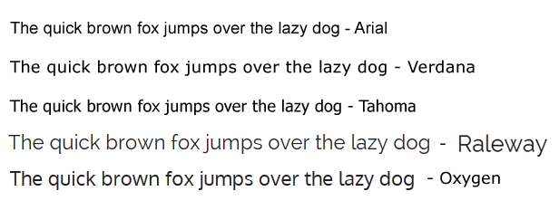
The Font
- We recommend a sans serif font.
- Avoid narrower fonts (also called condensed fonts).
Verdana, Arial, Helvetica (Mac), and Tahoma are all common sans serif fonts that are easier on the eyes. Google offers a number of other free fonts that can be integrated into your site. The differences can be subtle between san serif font types but if you want to maintain a unique stylized look, check out Google fonts.
Lettering and White Space
- Make sure you have enough empty space (called white space) so your site doesn’t look too busy.
- Make sure you have adequate spacing between paragraphs.
- Make sure that you have enough space around links, banners and buttons so each one is easy to click on with the mouse.
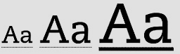
Font size
- 12 to 14-point font size is best (note pixels sizes on this blog post are slightly different than font points).
Here is 12-point (16 pixel) type.
Here is 14-point (19 pixel) type.
- Make it easy for people to change the font size.
Font weight
- Use bold type or a medium weight.
- For headings, increase the size and weight or use a color. If you use bold for body text, make headings stand out with size or color.
- For <H> tags, known as heading tags, increase the size of that font and also it’s weight. Also, consider using a different color.
Lowercase versus Capital Letters
- Make sure that you use uppercase and lowercase words. Using all capital letters is much more difficult to read.
- Italics are harder to read as well so use them sparingly if possible.
- THIS IS ALL CAPS – IT IS HARDER TO READ FOR MOST.
Justification (Alignment of text to the left)
Older readers are used to left-justified columns of information. Left justification means that there is an even left margin and the right margin is uneven.
Color
- Use high-contrast color combinations, such as black type against a white background. Avoid layering shades of the same color, such as dark blue type on a light blue background. Avoid colors that clash. For example, dark blue on red is very difficult on the eye.
- Colors that contrast well are good combinations. Black text on a white background is a great example of high contrast. Try to avoid harsh color combinations (e.g. red with a dark blue background).
- Also, avoid yellow and blue and green in close proximity. The differences in these colors are difficult for many older people to see.
- Group information visually be using good color combinations.
Use Good Navigation, Layout and Contrast to Make Things Easy to Find
Have you ever watched a child or grandchild use a technology device and marvel at their ability to use it with such ease? While younger generations may find your physical therapy web design easy to navigate, here are a few steps you can follow to make it easy for boomers as well. It’s especially important for navigation elements to be consistent, explicit, and predictable.
Web Design and Layout
Consistency will help older adults better understand how to use your website.
- Have a consistent look and design throughout the website.
- Use consistent icons, banners and symbols.
- Have the title of the page in a consistent color, font and site and in the same location across all the pages.
- Avoid distractions like pop ups
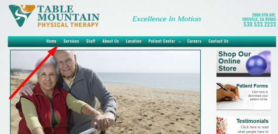
Navigation
- Make sure the navigation is the same across all the pages.
- Use bread crumbs when it takes multiple clicks for the viewer to arrive at a desired page.
- Try to structure your navigation so it doesn’t take more than one click to get to information.
- Make sure that a “Back to Top” or the “Go Back a Page” browser icons behave predictably.
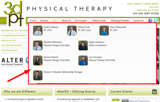
Menus
Make menus easy to use.
- If you use pull-down or fly-out menus, make sure they are visible for long enough time for the viewer to take action and click on a link.
- Do not use menus that require users to slide the mouse and click all in one movement.
- In the menu below, note that there are pictures of the therapists as well for clarification. This is called a mega menu system.
Links
- Write descriptive, easy-to-read links that help people predict what will happen next.
- Make sure your links are easy-to-understand, and people can predict what will be on the next page.
- Underline links for clarity.
- Use action words (verbs) when the link is about taking an action. If a link is meant for the user to take action, use action words (verbs). For example, “Click Here to Download Your Patient Paperwork”.
- Make sure the entire sentence is underlined, not just “Click here” in the example above.
Buttons, Banners, Icons
- Icons and buttons are easier to find when they are large, bright, and in a color that contrasts with the background.
- Make sure that your physical therapy web design includes buttons, banners, and icons that are bright, have good contrast, are bigger than just body text and it’s obvious that they link to another page.
- Make sure icons and banners do not require exacting movement for the viewer to click on them.
- Make sure they are a different color than surrounding text and images.
- If a bullet in a list is a link, make sure the text that follows the bullet is also a link and goes to the same target web page.
Mouse Functions
- Use single mouse clicks to access information. Use a single mouse click to allow the viewer to take action.
Scrolling
- Avoid the scrolling marquee text.
- Avoid any horizontal scrolling.
- Limit vertical scrolling.
- Keep key information above the bottom of a web page in a 1024 x 768 resolution monitor.
Search
- Use a search box if your website has pages that are greater than 2-3 clicks deep
- Use a search box as an alternate to viewers clicking through your navigation.
- Keep the search box in the same position across all of your pages.
- Try to offer alternatives for misspellings when people are using your search function.
Your Practice Contact Information
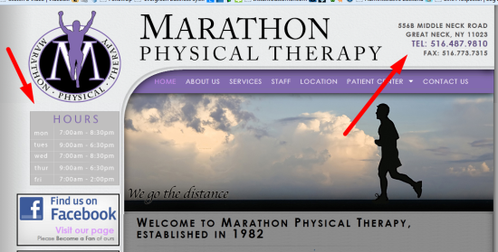
- Have your contact information present on all of your pages (name, address, phone number). Placing it at the top right of your web page and in your footer, is a common convention.
- Include your office hours on your home page and contact pages.
- Include your contact information on your Location/Map page if possible.
Audio, Video, Rich Media
- It’s good practice to use video (with audio for those that are visually impaired) and still pictures to complement text on a page. When you share the same information in different formats, it can help the viewer better retain the information.
- Avoid the use of Flash-it’s not supported at this time by Apple mobile and pad devices.
- Use mobile-friendly video and slideshow elements.
Photos and Graphics
Illustrations and photographs
- Illustrations and photos should support the text to enhance understand. Using them solely for decoration can be a distraction.
- If your physical therapy audience is primarily seniors or boomers, make sure you incorporate pictures of seniors/boomers into your message.
- Include captions whenever possible. It’s been proven that captions are read by more viewers than any other part of your website.
Video
- Use short videos (2-3 minutes max) to get your message across and decrease download times. Some may still be using dialup Internet access.
- Make sure it’s easy to understand how to play the video and adjust the volume.
- For important video, include a transcription of the message.
Wrapping It All Up: Using Your Physical Therapy Website Should Be A Fast, Easy And Enjoyable Experience
By following the recommendations above and in our Part 1 blog post, you can make sure your patients get the information they need to have a better experience at your practice. If possible, ask your patients if they visited your website and seek out feedback to improve the user experience. Open up your website for a few boomers at your practice and watch them use it. Doing so could be very helpful in recognizing opportunities for improvements. It’s important to realize that your website user experience is a small but significant part of clinical communication. Baby boomers and seniors need physical therapy services more than ever and are using the web more too. Good physical therapy web design and content development can go a long way to enhance your customer service and efficiency. [/info_box]
Leave a Reply
You must be logged in to post a comment.