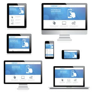
To ensure it is mobile-friendly, view your website on your smartphone, and while doing so ask yourself these questions:
Content
Does the site fit the screen?
Almost 50 percent of your audience already uses a mobile phone as their primary Internet access device. In other words, you are losing nearly half your audience if you do not make your website mobile-friendly. Make sure content fits on the screen and can be read without pinching and zooming.
Is the content readable?
Do not try to cram all the information you provide on your website into your mobile site. Make it easy for your patients to read and bear in mind that they might be reading it in a place with low light.
Does the site load quickly?
Include important information like phone numbers, addresses and maps which would be useful to people on the move. Instead of giving a detailed description about your practice, provide a one-liner, which is good enough to entice your mobile audience.
Do videos and animations load?
Avoid using large, Flash-based video files on your mobile site, as most smartphone browsers do not support Flash. Instead, use simple images to improve the look and feel of your mobile website.
Is the site responsive?
With the rapid evolution of touch-based smartphones and tablets, touch has taken over typing. When designing your mobile site, use drop down menus, check boxes, and pre-populated fields whenever possible, so that your mobile visitors can navigate and input information easily rather than having to fill in long forms.
Images
Are file sizes as small as possible?
Use simple compressed images and keep them small for faster loading. This will improve the look and feel of your mobile website—but make sure all images used on the desktop are set to resize automatically to fit a mobile device’s smaller screen sizes. We can do all of this for you (see our contact information).
Is there a home page icon set?
Nobody likes to be confused. Help users navigate between levels with clear “back” and “home” buttons.
Do all images fit on the screen?
Use plenty of negative space and don’t let the images overcrowd the page.
Usability
Do the gestures work?
Use large-centered buttons to reduce accidental clicks and make sure that they all work. This will ensure that visiting your site will not be a frustrating experience for your patients.
Is it thumb friendly?
People use their fingers to operate mobile devices, especially their thumbs. Design your mobile site so even large hands can easily interact with it.
Are number and e-mail addresses actionable?
Remember to use click-to-call functionality for all phone numbers.
Are forms easy to fill out?
Use check boxes, lists and scroll menus to make data entry easier.
Would you stay on the site?
Try to be objective and try to look at this through your patients’ eyes.

Leave a Reply
You must be logged in to post a comment.